Optimizing the Subscription Upgrade Flow
Company: DIRECTV
Role: Senior UX Researcher (Project Lead)
Timeline: 2025
Team: Product, Design
Method: Rapid, two-round moderated usability evaluation
Participants: 15 total across two rounds
Platforms Tested: TV upgrade flow prototypes
1. Problem & Context
DIRECTV was introducing a new One-Click Subscribe experience to enable existing customers to upgrade their subscriptions and add content packages directly from the TV interface. This flow was business-critical. It needed to reduce upgrade friction, increase add-on attachment rates, and improve conversion — while ensuring customers clearly understood what they were purchasing before committing.
Early design explorations raised concerns about package comprehension, pricing transparency, and readiness to proceed with upgrades. The team needed rapid user feedback to de-risk the experience before release.
I led a two-round iterative usability study to evaluate comprehension, decision-making, and confidence in the upgrade flow, and to guide design refinement.

2. Research Objectives & Key Questions
-
To what extent do customers understand what they are being offered in the upgrade flow?
-
Is pricing and package information clear and trustworthy?
-
Are customers ready and confident to proceed with an upgrade?
-
Which layout and information hierarchy best support decision-making?
3. Method & Rationale
We conducted two rounds of rapid moderated usability testing to identify comprehension issues, iterate designs, and validate improvements.
Moderated sessions enabled probing of mental models and hesitation points, while rapid turnaround between rounds allowed design refinements to be tested within the same development window.
4. Execution & Logistics
Round 1
-
Participants completed guided upgrade tasks using three prototype variations
-
Tested multiple customer scenarios and device contexts
-
Captured think-aloud feedback, confidence ratings, and behavioral observations
-
Identified comprehension gaps and mental-model mismatches
Round 2
-
Participants completed guided upgrade tasks using two refined prototype variations
-
Adjusted customer type, screen flows, and scenarios based on Round 1 learnings
-
Evaluated clarity, confidence, and readiness to proceed
-
Compared revised layouts and information hierarchy
5. Synthesis Process
I synthesized moderated session observations, confidence ratings, hesitation points, and open-ended feedback into themes highlighting mental-model alignment, comprehension risks, and layout effectiveness.
Findings were translated into prioritized design recommendations to guide immediate iteration.
Prototype Flow Comparison — Round 1 vs Round 2
Round 1
.png)
Round 2
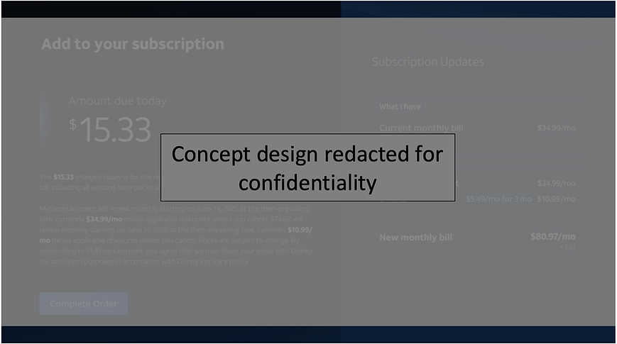.png)
6. Key Findings
Round 1 — Mental-model mismatches and comprehension gaps
-
Participants struggled to understand what content was included in upgrade options.
-
Pricing and package structure created hesitation and low confidence.
-
Many participants were not ready to proceed with an upgrade without additional clarification.
-
Visual design was perceived as clean, but information hierarchy did not support decision-making.
Round 2 — Iterative improvements increased clarity
-
Revised layouts and content hierarchy improved package comprehension.
-
Participants expressed higher confidence in understanding upgrade outcomes.
-
Elements from both tested prototypes performed well and were selected for further refinement.
-
Remaining friction points were isolated for targeted follow-up design work.
Confidence and Usability Comparison — Round 1 vs Round 2

Ratings reflect small-sample moderated usability testing averages and are directional.
Iterative design improvements increased user confidence, ease of use, and alignment with customer expectations in the upgrade experience.
7. Recommendations
-
Adopt high-performing layout and information hierarchy elements from both prototypes.
-
Continue simplifying package descriptions and pricing presentation.
-
Introduce contextual reassurance messaging to support decision confidence.
-
Conduct lightweight validation testing after final design refinements.
8. Impact
-
Identified mental-model mismatches that posed risk to upgrade conversion.
-
Informed rapid design iteration within active development timelines.
-
Reduced monetization risk by improving clarity and decision readiness.
-
Enabled evidence-based refinement of a business-critical upgrade experience.
9. Confidentiality Note
All visuals and product references in this case study have been anonymized and redacted to respect company confidentiality.