Improving Mobile Home Screen Discovery
Company: DIRECTV
Role: Senior UX Researcher (Project Lead)
Timeline: 2025
Team: Product, Design
Method: Large-scale unmoderated evaluative study
Participants: 200 total
-
DIRECTV Stream (Service A) users (n=100)
-
Service B users (n=50)
-
Service C users (n=50)
1. Problem & Context
DIRECTV was redesigning the mobile app Home screen to improve content discovery and browsing efficiency, a key driver of viewing engagement. A key product decision involved determining the optimal poster size for the Home screen layout. Larger posters improved readability and visual comfort, while smaller posters increased scannability and allowed more content per screen.
This decision carried risk: choosing the wrong layout could degrade discovery, slow browsing, or alienate existing users. The team needed evidence to select a layout direction before committing engineering effort.
I led an evaluative study to compare two Home screen designs and provide data-backed guidance on which poster size best balanced readability, efficiency, and user preference.

2. Research Objectives & Key Questions
-
Which poster size do users prefer, and why?
-
Do users view the smaller-poster design as an improvement over the current app?
-
How would users feel if the smaller-poster design became the default?
-
How do the designs compare on readability, scanning ease, content discovery, comfort, and visual appeal?
3. Method & Rationale
We conducted a within-subjects unmoderated comparative evaluation so each participant experienced both designs. This enabled direct preference and performance comparisons while controlling for individual differences.
An unmoderated format allowed rapid data collection at scale, while combining behavioral metrics with attitudinal ratings and open-ended feedback ensured quantitative rigor while capturing qualitative context.
4. Execution & Logistics
-
Ran content discovery tasks with participants on two Home screen prototypes
-
Isolated poster size as the only design variable while holding content constant
-
Measured task success, time-on-task, and confidence
-
Collected experience attribute ratings and open-ended feedback
-
Applied age quotas across 18–75+ to ensure representation
5. Synthesis Process
I synthesized findings across multiple data streams, including:
-
Task performance metrics
-
Attribute rating comparisons
-
Preference distributions
-
Thematic analysis of open-ended feedback
Findings were consolidated into an executive readout highlighting experience tradeoffs, behavioral performance differences, and risk assessment for each layout direction.
Prototype Comparison — Home Screen A (Smaller Posters) vs Home Screen B (Larger Posters)
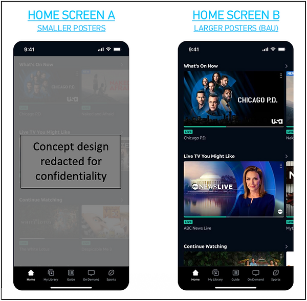.png)
6. Key Findings
Smaller posters improved content discovery and scanning
-
The smaller-poster design outperformed the larger-poster design on 10 of 11 experience attributes, including ease of scanning, finding content, and overall discovery.
Larger posters supported readability
-
Larger posters were rated higher for text and visual readability, especially among older participants.
Behavioral performance favored smaller posters
-
Higher task success rates and faster completion times were observed on discovery tasks using smaller posters.
Overall preference leaned smaller
A majority (56%) preferred the smaller-poster design versus 44% for larger posters.
-
Younger and mid-age users leaned toward smaller posters; older users leaned toward larger posters.
Risk assessment
-
Both designs were acceptable, but the smaller-poster layout showed higher satisfaction and fewer detractors, indicating lower rollout risk.
Attribute Comparison Chart — Home Screen A (Smaller Posters) vs Home Screen B (Larger Posters) Performance

*Items in green are statistically significant
7. Recommendations
-
Proceed with the smaller-poster layout as the default Home screen design.
-
Address readability concerns through typography tuning and accessibility options.
-
Explore personalization controls to allow alternate tile sizing for users who prefer larger visuals.
8. Impact
-
Provided evidence-based guidance that informed a key product design decision in the mobile Home screen redesign.
Findings were adopted as the chosen design direction for the redesigned mobile Home screen.
-
Reduced risk of shipping a layout that could hinder content discovery or browsing efficiency.
-
Informed downstream design refinements and accessibility considerations before engineering implementation.
9. Confidentiality Note
All visuals and product references in this case study have been anonymized and redacted to respect company confidentiality.